Java Layout Managers
This page contains a few layout managers which I have written to help ease the task of laying out Java components when the existing layout managers don't quite do what I want them to do. You can use these in your own code freely, though I'd appreciate an email message if you use them (just for the warm glow) or if you find any bugs.
License
The downloadable source code on this page is released under the Apache License. Basically, this means that you are free to do whatever you like with this code, including commercial use, but it's not my fault if your satellite/nuclear power station/missile system fails as a result.
Licensed under the Apache License, Version 2.0 (the "License"); you may not use this code except in compliance with the License. You may obtain a copy of the License at http://www.apache.org/licenses/LICENSE-2.0 Unless required by applicable law or agreed to in writing, software distributed under the License is distributed on an "AS IS" BASIS, WITHOUT WARRANTIES OR CONDITIONS OF ANY KIND, either express or implied. See the License for the specific language governing permissions and limitations under the License.
ConstraintLayout
This layout is an abstract class which handles constraints and simplifies implementation of new layouts. It's used as the superclass for most of the other layouts. It provides a configurable horizontal and vertical margin around all components. In addition, it has an option to allow the layout to include invisible components in its layout policy. If this is set, you get an empty space where invisible components should be, otherwise invisible components are just missed out completely.
CentreLayout
This layout is very basic: It simply centres one component in its parent. This can be quite handy sometimes such as when you want to draw a picture in the centre of something, but don't want to keep working out the offsets yourself. It also has a use with JScrollPane - if you use it as the layout of a panel in a JScrollPane, then when the component to be scrolled is smaller than the viewport, it'll get centred instead of going to the top left, which is often desirable.
	JComponent thingToBeCentred = ...;
	JPanel vp = new JPanel();
	vp.setLayout( new CentreLayout() );
	vp.add( thingToBeCentred );
	JScrollPane scrollPane = new JScrollPane( vp );
StackLayout
The StackLayout lays out each of its children in the parent conttainer according to a fill and alignment provided as a constraint. This allows components to overlap, which is occasionally useful. The default alignment is to centre the component in the container.
For example:
	setLayout(new StackLayout());
	add(c1, StackLayout.alignment(Alignment.FILL_NONE, Direction.WEST));
	add(c2, StackLayout.alignment(Alignment.FILL_HORIZONTAL, Direction.NORTH));
BasicGridLayout
This is a useful layout which is more powerful than the GridLayout. Like the GridLayout, you specify a number of rows and columns for your grid, but instead of making each component the same size, it makes each column as wide as the widest component it it and each row as tall as the tallest component in it, It then uses separate row and column weightings, (like GridBagLayout) to fill in any extra space. The default weights are zero which puts all components at the top left, but if you set the default weights to 1, it behaves like GridLayout. Finally, it applies an alignment and fill to each component in its cell. The main use for this class is as a superclass for GridLayoutPlus (below), but it can be useful in its own right. There are a few methods which you can override to customize the behavior of this class for producing your own specialized grids.
GridLayoutPlus
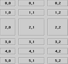
This is a very useful layout which comes somewhere between the GridLayout and GridBagLayout. It's simpler to use than GridBagLayout, but more powerful than GridLayout. It's an extension of BasicGridLayout, but allows you to set the row and column weights and cell alignments on a individual basis. One typical use would be in a two-column dialog: set the left column weight to zero and the right column weight to 1 and your labels will stay fixed in width while your textfields will expand as the dialog is resized. Here's some sample code and a picture:
	GridLayoutPlus glp = new GridLayoutPlus(0, 3, 10, 10);
	glp.setColWeight(1, 2);
	glp.setColWeight(2, 1);
	glp.setRowWeight(2, 1);
	f.setLayout(glp);
	for (int r = 0; r < 6; r++) {
		for (int c = 0; c < 3; c++) {
			f.add(new JButton(r+","+c));
		}
	}
Paragraph Layout
This layout was born from frustration in trying to lay out dialogs. There's no simple way to create the standard two-column dialog layout of labels on the left and components on the right without a lot of messing around with GridBagLayout and alignment options. Those of you who have read "Java Look and Feel Guidelines" will have noticed that while they tell you a lot about how your dialogs should look, none of the standard layouts will let you build them easily. This layout will.
The model for this layout is similar to laying out text with hanging indents. For each component you add, you specify a constraint which is NEW_PARAGRAPH or NEW_LINE. The first of these specifies the beginning of a paragraph: i.e. a label which will go into the left column. Components added after this are placed in the right column from left to right until you specify a NEW_LINE or another NEW_PARAGRAPH. A NEW_LINE starts a new line within the right column. Labels are centred with the first row of each paragraph, unless you specify NEW_PARAGRAPH_TOP which will top-align them.
There are three sets of parameters: hMargin and vMargin specify a space around the whole layout. vGapMajor specifies the spacing between paragraphs and vGapMinor the gap between lines. vGapMajor is the gap between the two olumns and vGapMinor the spacing between components in a line. The defaults are something similar to those for the "Java Look and Feel Guidelines".
Here's some example code and the resulting layout:
	setLayout(new ParagraphLayout());
	JButton b1 = new JButton("One");
	JButton b2 = new JButton("Two");
	JButton b3 = new JButton("Three");
	JButton b4 = new JButton("Four");
	JButton b5 = new JButton("Five");
	JButton b6 = new JButton("Six");
	JButton b7 = new JButton("Seven");
	JButton b8 = new JButton("Eight");
	JTextField t1 = new JTextField(4);
	JTextField t2 = new JTextField(20);
	JTextArea t3 = new JTextArea(5, 30);

	b2.setFont(new Font("serif", Font.PLAIN, 24));
	add(new JLabel("Some buttons:"), ParagraphLayout.NEW_PARAGRAPH);
	add(b1);
	add(new JLabel("A long label:"), ParagraphLayout.NEW_PARAGRAPH);
	add(b2);
	add(b3);
	add(new JLabel("Short label:"), ParagraphLayout.NEW_PARAGRAPH);
	add(b4);
	add(b5, ParagraphLayout.NEW_LINE);
	add(b6);
	add(b7);
	add(b8, ParagraphLayout.NEW_LINE);
	add(new JLabel("Text:"), ParagraphLayout.NEW_PARAGRAPH);
	add(t1);
	add(new JLabel("More text:"), ParagraphLayout.NEW_PARAGRAPH);
	add(t2);
	add(new JLabel("miles"));
	add(new JLabel("A text area:"), ParagraphLayout.NEW_PARAGRAPH_TOP);
	add(t3);
As you can see, it's a lot easier than using GridBagLayout or nested panels to achieve
the same effect.
Packer Layout
This layout is a bit tricky to describe. As you add components to the layout, it keeps the bounding box of all components added so far. You specify for each component where it goes in relation to the current bounding box: left, right, above or below as well as the fill and alignment in its cell.
	setLayout(new PackerLayout());
	JButton b1 = new JButton("One");
	JButton b2 = new JButton("Two");
	JButton b3 = new JButton("Three");
	JButton b4 = new JButton("Four");
	JButton b5 = new JButton("Five");
	JButton b6 = new JButton("Six");

	b2.setFont(new Font("serif", Font.PLAIN, 24));
	add(b1);
	add(b2, PackerLayout.LEFT_CENTER);
	add(b3, PackerLayout.BOTTOM_CENTER_FILL);
	add(b4, PackerLayout.TOP_CENTER_FILL);
	add(b5, PackerLayout.TOP_LEFT);
	add(b6, PackerLayout.RIGHT_CENTER);
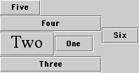
The main use for PackerLayout is with fairly simple panels with just three or four
components.
ClockLayout
This is a very silly layout created for a special purpose. It simply lays out its components in a circle, clockwise from the top.
Download
You can download the source and a test application for the layouts as a zip archive here. Let me know any comments you have,